Friday 11 April 2014
My Final music video
My Final Ancillary Texts.


Above are all of my Final Ancillary texts. In order from top to bottem there is my Final Front Cover for my CD Album, my DVD, CD, Final Back Cover of my CD Album, my Poster and my Digipak. When placing all of my Ancillary texts together I was able to see how well they all worked together, as well as adding them to a Digi-pak template and printing it out. When looking at my Ancillary texts you can see the continuity throughout with the same use of text font, artist name and coloured effect on the image. These are all conventions of real media texts. Not only the ones above, but the photos used within the Ancillary texts show continuity from the video, and within themselves. There is realism of the small text used on the poster and the CD back and CD's. These where key conventions showed on real media texts that I looked at.
All together I think that my main Ancillary texts work really well together and the feedback that I had from posting them on Facebook was really good. I have posted a picture below of what comments I achieved.

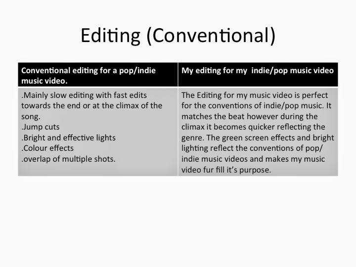
Evaluation- Question 1
In what ways does your media product use, develop or challenge forms and conventions of real media products?
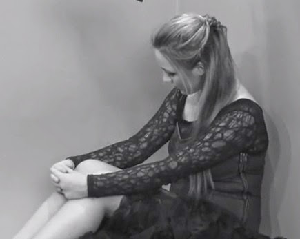
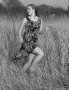
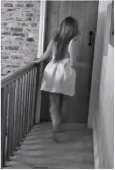
The song that I chose for my Music Video was 'Over the love' by Florence and the Machine. A hippy/indie artist that forms the genre of Baroque Pop. The audience from this are stereotyped as individual and follow the hippy lifestyle, live whilost your young but also form into the 'emotional' peoples category. Florence and the machine is signed by multiple record labels and performs at large festivals, mainly becuase it is her target audience. I was mainly ifluened by videos of Florence and the machine, and spectrum, however this video was much faster and I wanted to use 'over the love' as it was a slow song and I felt the editing would be better for me to work with. I also wanted to express in my video a narrative, this narratuive would show a troubled person in someway, whether they have lost someone, troubled with themselves, or depressed over childhood memeories. By choosing this narrative it allowed my editing and shots to fall into place with the lyrics of my song. By following the narrative it allows me to create continuity throughout my main product and ancillary texts by taking simillar framing shoots for cinematogrpahy, editing, mise-en-scene and emotions that come across from my artist.
One of the main conventions in indie/pop and baroque pop is to promote the artist within the music video. This is what I have done by creating a performance within the video so that the audience can relate to the artist as well as being interested by their music style. Some of the main influences of my music video were from florence herself but in the indie/pop era there were other videos themselves.
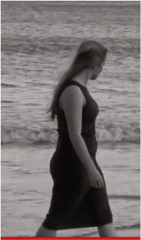
In this video of Beyonce and Broken hearted girl, I found influence in the location. I thought that filming on the beach related to my genre and would relate to my narrative of a girl with depression drowning, as there is alot of water at the beach and overlayed shots could look effective of the waves over a shot. Also the black and white effect looks good and relfects my genre of indie/pop.
This Video of Florence and Machine helped me in the use of emotion in the face. When Florence performs she shows so much emotion you can feel it by watching her. I wanted this to come across in my music video and allow my audience to be able to relate to it. I also like the way that she has used effects by overlapping light particles on different shots.
This music video inspired me from the effects used and lighting. It also influenced me from the use of cinematography. I really liked the use of close ups to show the emotion of the artist. The dramaticness of Florence made the video very powerful especially when she flings her arms out to create a shock when the base of the music gets louder or the song leaves on a cliffhanger. The use of green screen inspired me as it means you could create whatever you want as a background.
Table of Conventions

I created this table of Conventions that are key for my chosen genre of indie pop. By doing this it allows you to see what the key conventions are to create my genre and which I have used within my main product and my ancillary texts. I feel that I have used plenty of the above Conventions and that all of my media products reflect the genre of baroque pop effectively.


Above are the sketches of my costumes where as below are scenes from my video of Emily in the costumes.


Florence and the Machine- 'Over the love'
Ever since I was a child
I've turned it over in my mind I sang by the piano
Tore my yellow dress and
Cried and cried and cried
And I don't want to see what I've seen
To undo what has been done
Turn off all the lights
Let the morning come, come
Now there's green light in my eyes
And my lover on my mind
And I sing from the piano
Tear my yellow dress and
Cry and cry and cry
Over the love of you
On this champagne-drunken home
Against the current of gold
Everybody see I love him
'Cause it's the feeling that you get
When the afternoon is set
On the bridge into the city
I don't want to see what I've seen
To undo what has been done
Turn off all the lights
Let the morning come
There's green light in my eyes
And my lover on my mind
And I sing from the piano
Tear my yellow dress and
Cry and cry and cry
'Cause your're a hard soul to save
With an ocean in the way
But I'll get around it
'Cause your’re a hard soul to save
With an ocean in the way
But I'll get around it
Now there's green light in my eyes
And my lover on my mind
And I sing from the piano
Tear my yellow dress and
Cry and cry and cry
Over the love of you
Cry and cry and cry
Over the love of you
(I can see the green light
I can see it in your eyes)
Cry and cry and cry
Over the love of you
I can see the green light
I can see it in your eyes


 Below I have created 2 Prezi's that express the conventions of Form and my genre conventions. These Prezi's are to express what conventions there are within my chosen Genre, and the conventions of form (music video). I created these 2 Prezi's earlier this year before creating my music video, and so they have helped me to create a music video that relates to my genre's conventions.
Thursday 10 April 2014
Wednesday 9 April 2014
Audience feedback.
My Record Label
A Record Label of a company controls what the artist is seen like, for instance- publishing the artists name, brands seen with the artist, music videos that are published, advertising, and if its a great record label, like one of the big 4, it makes you known as a good artist by name. A record label is a brand/trademark which is part of the marketing and production of a music artist including the enforcement of copyright for sounds recording for the artists and their managers.
The Big 4 are as follows:
1.Sony
2.Universal
3.EMI
4.Warner.
These four represent the majority of the music sold around the world, making up as much as 75% of the music market per year.
My Record label that I chose for my artist was Sony Music. Sony is a Global company with a variety of different artists including world-wide artists and local artists. Sony is owned by Sony corporation of America that owns different premier record labels covering a range of all music genres.
I chose this record label as it is so well known. it would be able to get my artists name out there to my audience, and find a place in the music indusrty. It would allow better protection of sound, being a top 4 and being mixed with other artits signed to this record would link my artist into a wider range of events, again getting her name out.
Monday 7 April 2014
Pie charts for audience feedback questionaire

Above are the questions that I asked my audience for some feedback on my Final Music Video.

The main question of my feedback was: Does it fur fill its purpose as a Media Form?
Yes was blue and red was no. These results show clearly that more people said yes than no, showing that my music video does fur fill its purpose as a media form.

The smaller pie charts are other questions that I asked my peers and the answers are as shown. The keys at the side show what the answers are, however the blue shows the positive feedback showing that a lot of people liked my video. This also surprised me as the peers I showed it to were not all stereotyped as the audience for my chosen genre, so I was intrigued as to how many people liked it. There were a few negative comments as you get with anything, however I am really proud of the feedback that I have achieved.
Saturday 5 April 2014
My ancillary texts in the real world.

I placed my poster onto a bus stop to se how it would look. I love how it grabs your attention, especially the cartoon effect on the image of emily.

This fits in so well on the big top 40 chart, which proves that the front cover of my cd is realistic to real media forms.


Final layout of Digi-pak

This is my Final Digi-pak. I have created spines for this Digi-pak which I used the same image I placed inside of my CD. I felt this created more continuity throughout the Digi-pak, however I placed these spines in black and white so they didn't take the effect away from the photos. I did however place red font for the text on the spine, making it stand out against the black and the white. I feel that this is a strong Digi-pak and from the font, the imagery, the small print and the logos used it is conventional to its genre and real media texts.
Digi-pak layouts


This shows 2 layouts of my Digi-pak, only showing 1 CD however. This is to show what my Digi-pak looks like in both all black and white or some in colour. I feel that the one in colour looks most effective and realistic to its genre as the colours create an eye-catching point and look most realistic to a real media product.
Creating of my Digi-pak


I have screen shot every part of my creating of my Digi-pak. This is to show you how I created it, and what tools and images I used to do so.
This is my Final CD.

Friday 28 March 2014
Digi pak with cd and dvd.

Subscribe to:
Posts (Atom)